 You Can't Do That on a Bicycle!
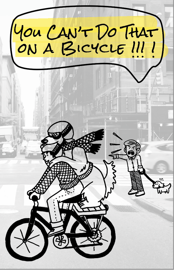
“You Can’t Do That on a Bicycle!” is an original zine (a DIY self-published book) created for a digital typography and self-publishing class. The finished product will be available for purchase at stores such as Quimby’s Books, Chicago Comics, and Alley Cat Comics.
Skills Used
- Project management
- Creative writing
- Content design
- Adobe InDesign
- Adobe Photoshop
- Adobe Illustrator
- Creating original artwork
Considerations and Challenges
A printable first draft of the zine must be finished within the time limit of the class
I originally created this zine for a five-week class. I needed to have a presentable, printable draft ready to trade with my classmates by the end of the fifth week. To keep within the deadline, I did the following:
- Made sure to limit the scope of the project to something I believed I could finish in the designated time
- During the outlining phase, I determined must-haves, as well as various levels of stretch-goals that could be included once the must-haves were achieved
- Planned my production schedule meticulously, and set aside designated chunks of work time throughout each week
The zine must be cheap to produce
I made this zine in a bi-fold format, which means each two-page spread is equivalent to one landscape-oriented sheet of standard 8.5” x 11” paper. I designed each page with a simple, limited color palette. These choices made the zine easily printable on a home printer.
The zine must be eye-catching and visually appealing
With no marketing or built-in distribution method, a zine has to stand out on a shelf of similar work. It must be eye-catching in order to entice the casual bookstore browser to first pick it up off the shelf. Then, it must be packed with information, engaging, and entertaining to encourage the reader not only to give it a quick flip, but to also determine that it requires a more thorough read and should be purchased.
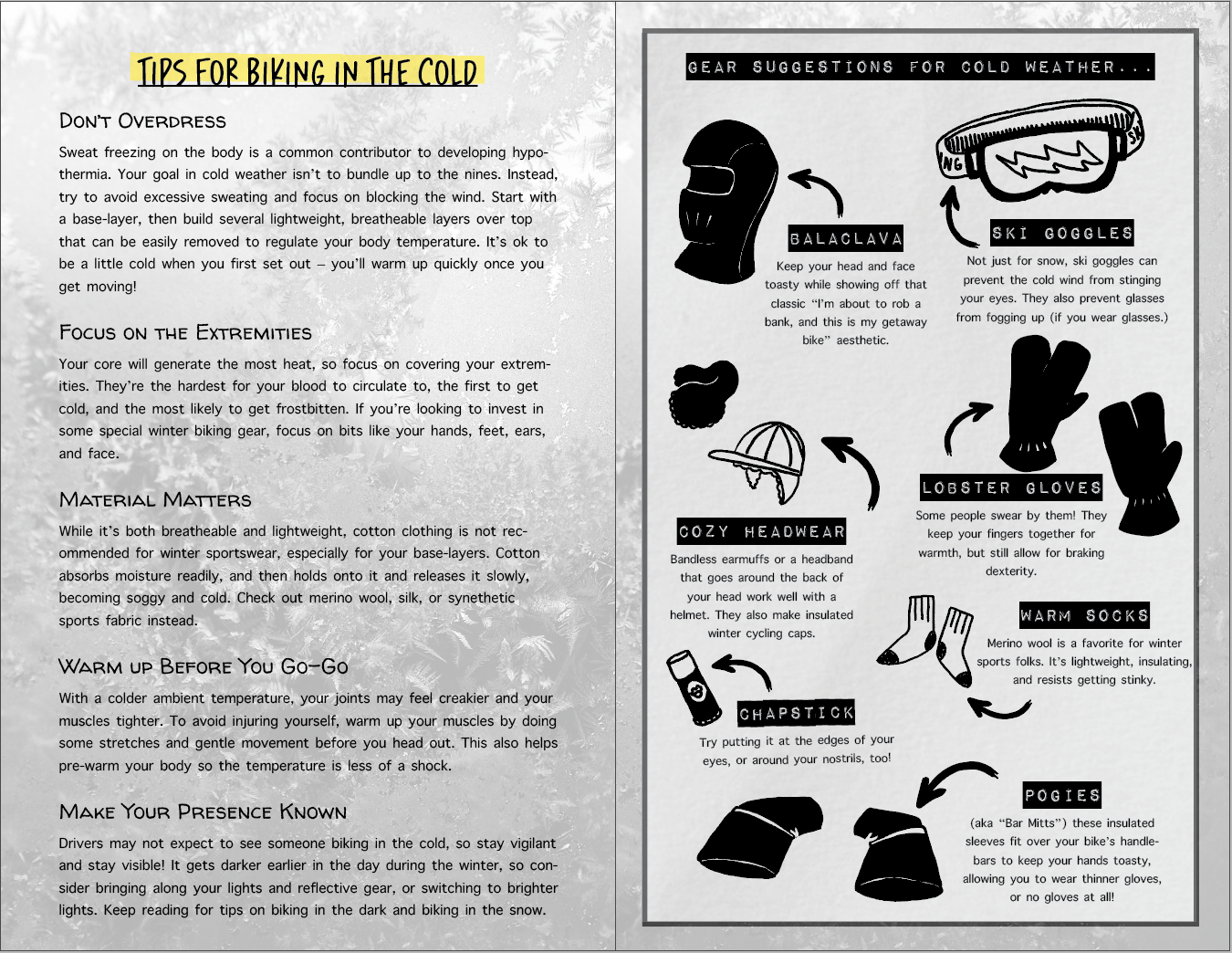
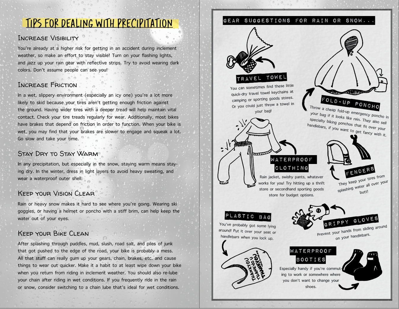
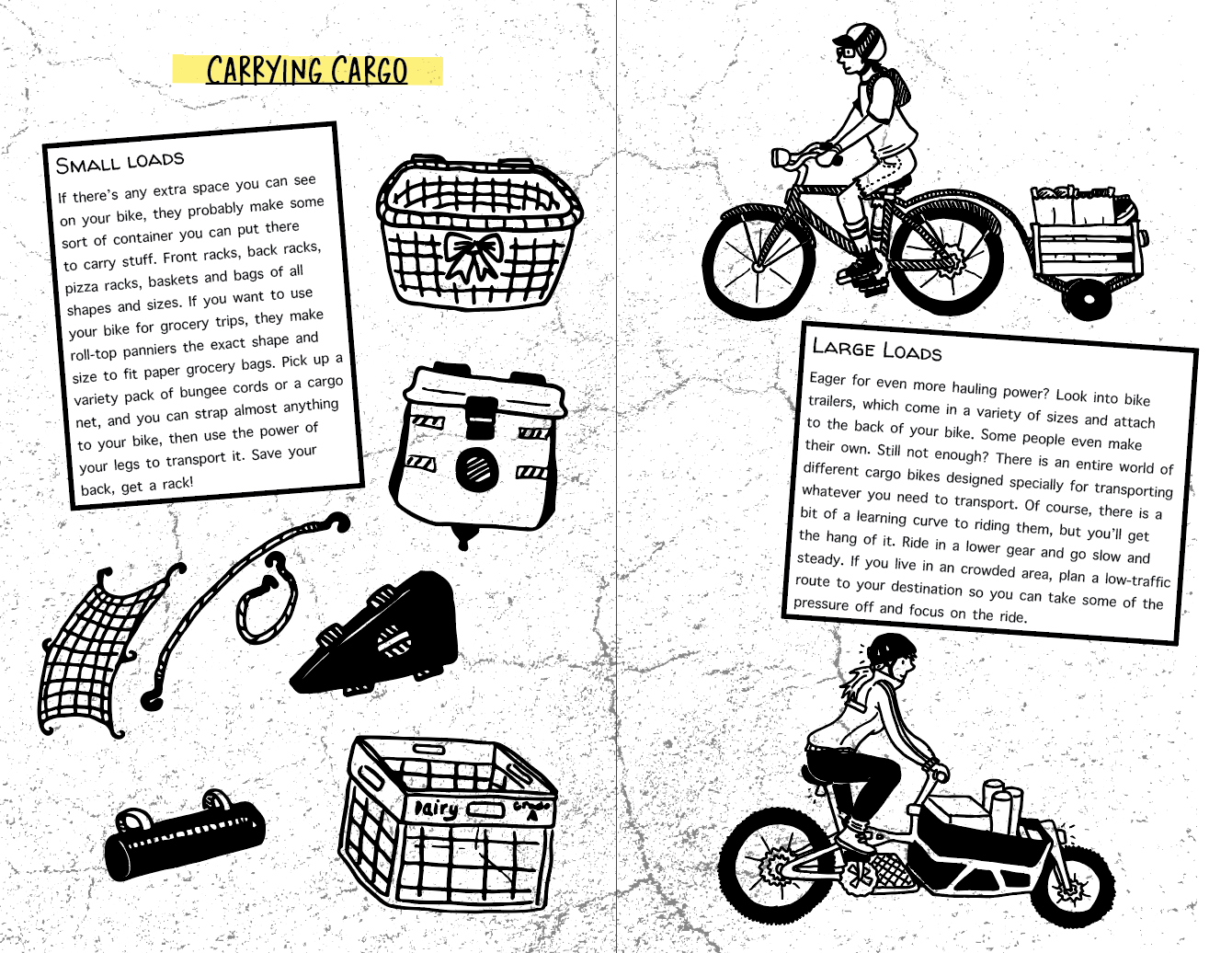
All the information in each individual page needed to fit within half a sheet of standard paper (a space that comes out to quite a bit less than 4.25” x 5.5”, when factoring in margins and spacing.) The information on each half-size page needed to be formatted such that it all fit without looking too cluttered, and the text was still big enough to be readable. I chose to illustrate the zine with my own line art because I wanted to (I like drawing, and I wanted to get more experience using Adobe Illustrator.) However, using artwork also added visual variety and fun to the page and created an engaging infographic feel.
I chose black and white line-art specifically to cut down on cost and time. The entire zine was originally going to be black and white for the same reason, but I ultimately decided to add one color (a bright yellow highlighter effect) to bring attention to some areas. It sacrificed a small amount of the cost-per-page I was saving by printing in black and white, but the zine gained a lot of visual appeal.
Process
1. Outlining
I started with a rough outline of the pages I wanted to include based on the information I wanted to present. This is where I decided how to organize the information. In order to print properly in a bi-fold format, the zine needed to have a number of pages that was divisible by four, so I had to be mindful of that when planning.
2. Layouts
Using Adobe InDesign, I created the basic layout for each page in my outline. I added backgrounds and page titles, and placed text boxes with placeholder content to visualize the look of the zine. This is also where I decided on a color scheme, fonts, and other text styling.
3. Feedback and Revisions
I solicited feedback on the basic content and layout of the book from friends who had knowledge on the subject. Then I made revisions. This resulted in a page being added, which threw off my page count, so I re-did some of the layouts to compensate.
3. Content Creation
Throughout the next two weeks, I slowly filled in the content of each page layout in InDesign. The illustrations were hand-drawn, inked, and then scanned and turned into vector art using Adobe Illustrator.
5. Test Print and Second Round of Revisions
I created a test print on the printer I would be using for the final project. This allowed me to fix any technical issues with margins, color, or content placement. I also used the test print to solicit more feedback and make a few final revisions.
6. Final Print
The final version was printed in class, assembled, and distributed to classmates. Based on additional feedback I have received, I made more revisions and will do a second, revised printing in the future before I commission it for sale.